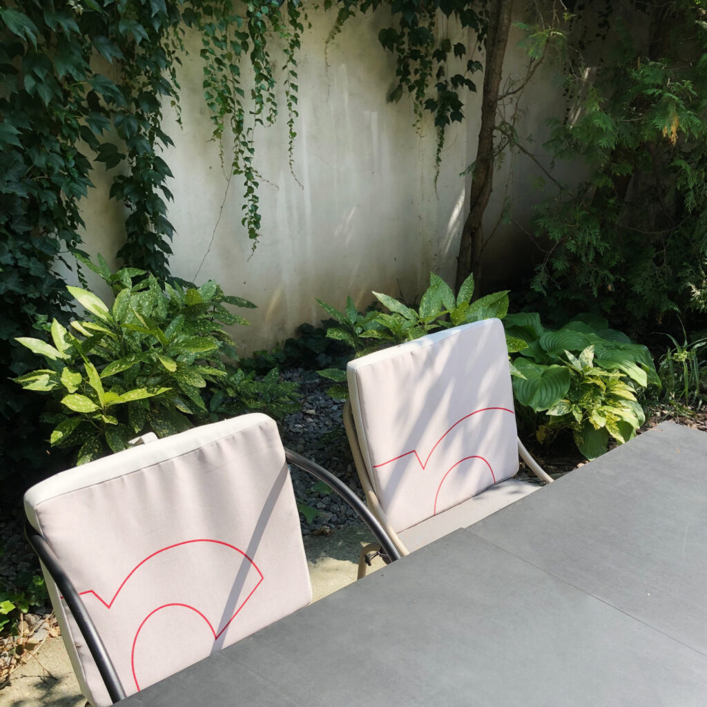
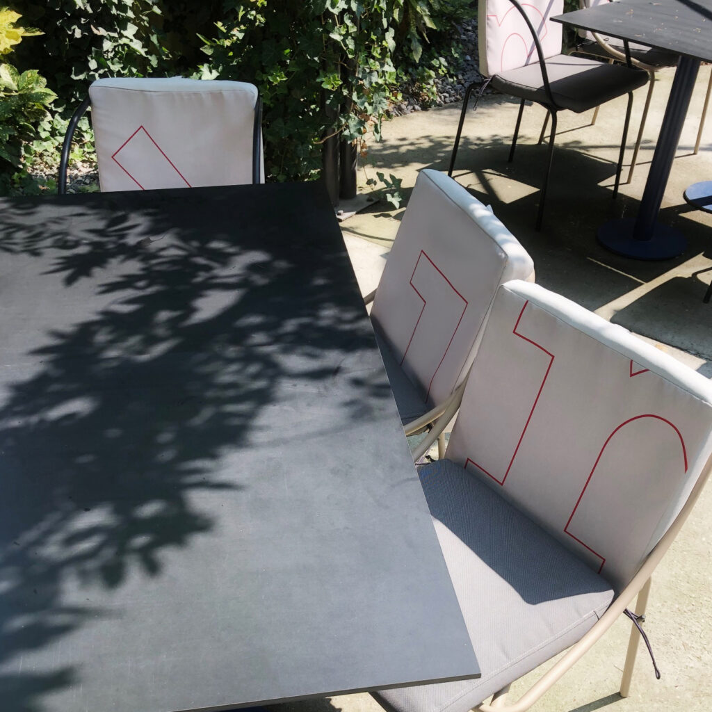
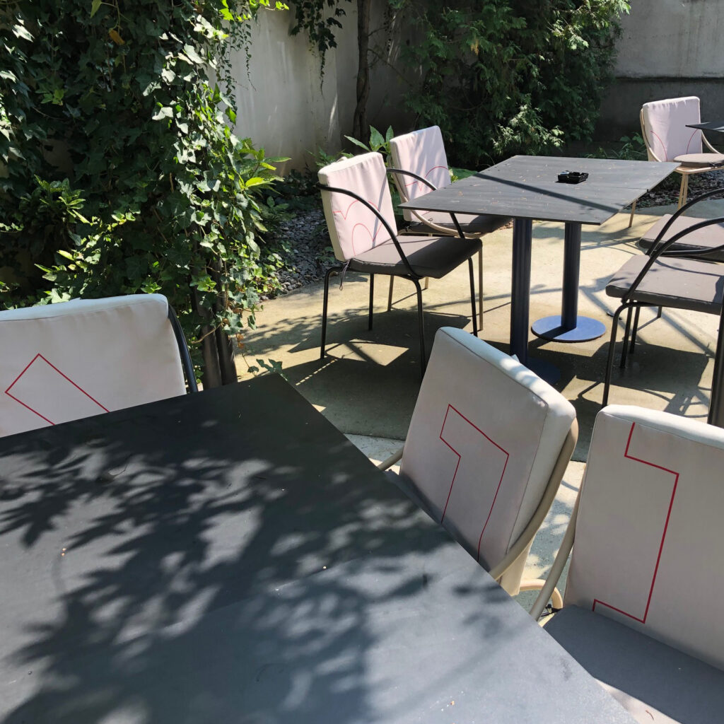
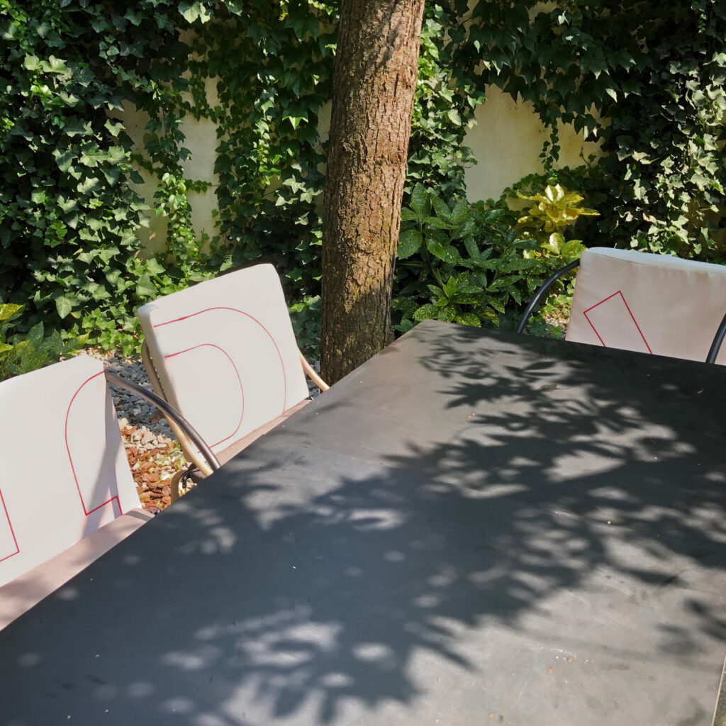
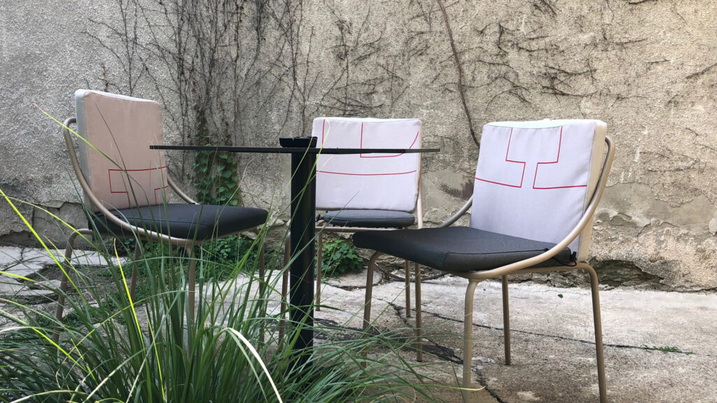
Project: uniquely designed cushions for the courtyard garden of the Berliner restaurant.
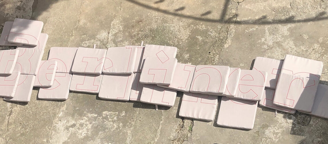
We decided to play with the Berliner logo using its iconic typeface by design studio AUTORI (creators of Berliner’s celebrated visual identity and interior design) and the red from the brand color palette. Reducing the letters to the contour uncovers pure lines. Then we decompose letters by cutting parts out and came to a convincing abstract drawing.
In this way, we kept something of Berliner recognizable aesthetics and achieve something new, subtle geometry that emphasizes and completes the unpretentious Zen quality of the garden. We chose a shade of beige close to the colors of sunny sand, gravel, and the color of creeping walls that protect from view and seem to stop the flow of time.
This decent and discreet intervention demonstrates when less is more.


